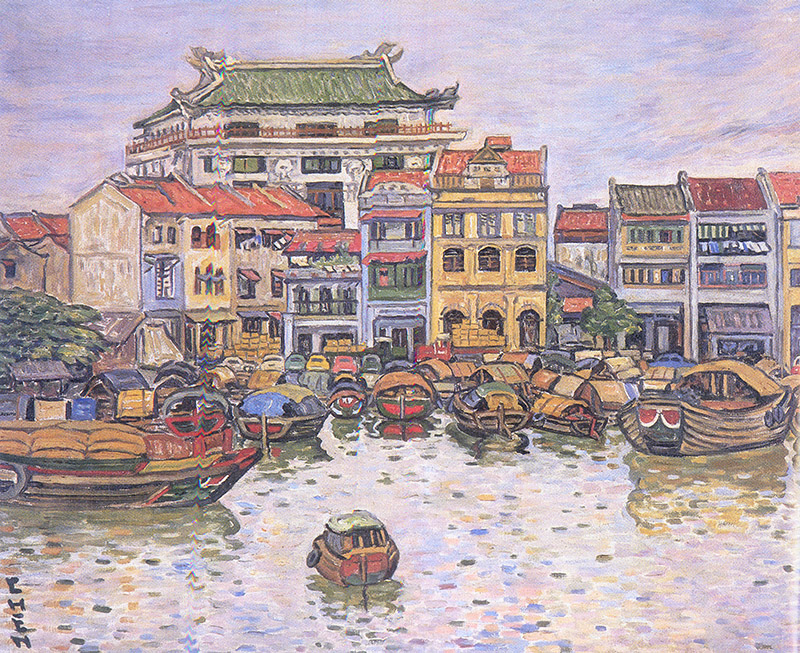
Artist: Georgette Chen
Title: Singapore Waterfront
Created: In 1958
Medium: Oil on canvas
This painting shows Singapore River with some boats and some Ancient
buildings which shows that people trades in the old days.
In this painting, oil painting, pencils and markers are used. The colours of
this painting is dense.
The colours used in this painting were purple-blue, green, red, dark
yellow, medium brown and black.
The shapes of this painting were squares, rectangles, triangles,
trapezium, parallelogram and semi-circle. In my opinion, the texture
of this painting is rough.
yellow, medium brown and black.
The shapes of this painting were squares, rectangles, triangles,
trapezium, parallelogram and semi-circle. In my opinion, the texture
of this painting is rough.
The title of this painting is Singapore Waterfront because it represents
poetic, serene, pleasing light, sensuous, pointillist touch of the brush to
reveal the transparent and atmospheric quality of waterbased on Georgette
Chen, the artist.
The story behind this painting shows about the history of Singapore and it
depicts the olden days when we would trade our goods in the Singapore
Waterfront.
In my opinion, the mood of this painting is relaxing and attractive as the
artist uses light colours for the sky which exude the sunny airiness of a
tropical landscape. She also control the brush strokes to form
atmospheric quality water in this painting.
In comparison, the difference between the painting she drew for the
mosque in Kuala Lumpur and the painting she drew for the Singapore
Waterfront are that both paintings were from different countries and it
shows the different developments of these two countries in the olden
days.
All in all, I feel that this painting she drew was my favourite picture
as it looks attractive and interesting.